Mobile App Analytics With Google Analytics Android App

Once you look at the number of people using their mobile phones for functions apart from the normal "calling", it doesn't strike a surprise that the handheld devices are really churning out the traffic. And with the interest the app developers are bombarding the mobile world with the different apps, the consumers (or users) are using these apps with as much comfort and interest as well.

Google Plus In Between The Updates

By now we are used to getting some nicely crafted updates from Google on their social network in a bid to get better for their web as well as smartphone users. So it isn't a surprise that we see updates to both version (web and mobile app) very often.

Cafe4tune: Social Network with 3D touch and Karaoke Options

Cafe4tune, founded in 2011 offers its users larger than life ways of interacting in 2D as well as 3D virtual environments. The environments that we talk about are in the site' lingo are called Cafes. You can design your Cafes as per your needs. You can create a profile for you (individual profiles) or there could well be organizations that can join the network.

ApnaCircle Launches New Profile

This new feature comes in after they launched their corporate site earlier this month. The look of the new profile is really exciting so we dive in for a treat straightaway without any delay :). We would have liked to capture the full profile look for you...

Facebook Beautifies Photos and Notifications

Facebook has started rolling out changes to its photos page on Timeline as well as on the notifications that you receive about your photo posts. As per our last update today, users have started seeing the changes on the notifications drop...

Social Media And Your Network

Social media is a bubble for whose existence we all (well, nearly all) agree with. If you think otherwise, we would love to hear your views on the Facebook-Instagram deal as detailed on our post the other day. Existence of this bubble makes us think of how cramp the bubble would be with so many things finally making it burst.

Thursday, 31 May 2012

Google Plus Local With Zagat

Google Plus LocalRemember Google Places? If your answer is no (in the slightest of chances), don't bother to Google it as Google itself gave you a reason to forget it. On Wednesday, Google announced that it's replacing Google Places with another product that seems aimed at a tight integration with its social network Google Plus and is being speculated yet another effort of the search engine giant to make sure its social network gets to each person on browsing the web. Google Plus Local has been designed with the aim to create a seamless experience for the web user and fulfilling one of your most important requirement of 'finding the best place to go'!!
Google Plus Local With Zagat
As of Wednesday May 30, 2012; Google Plus users should start seeing a new menu item on the ribbon menu showing up in the left side bar of their Google Plus page. That's Google Plus Local!! Designed to let the users discover and most importantly share information about their local restaurants, shops and even sites or businesses; whatever you may call them by. 

As of Wednesday launch roughly around 80Mn business pages have been moved over from now dead(well, almost) Google Places to the all new Google Plus Local. These business' now have their very own Google Plus page and while they were moved, the change was conveyed to the business owners via a post by Google on its Google and Your Business Blog. So if you are a business owner that was listed on Google Places, head over to the link and do some catch straight away as the option to control your page on one of the best online maps (Google Maps) actually now becomes a dead end requirement.


Google Plus Local With Zagat
Besides taking a full scoop of business listings from Google Places and moving them over to Plus Local; Google pretty much played the cards well with the inclusion of reviews and ratings from Zagat for quite a few of these business'. Zagat, if you recall, is a reviewing system that the search giant acquired in Q3 last year.


The business' will receive a Zagat score on a scale of 1 to 30 (move higher for better) while including factors like their decor, service etc. Bringing in this review system means Google is now doing away with the five start rating system that was so usual with Google Places. Zagat's system will now combine with the older reviews and convert them to the new system. Each place you now see on Google+ Local will be scored using Zagat’s 30-point scale, which tells you all about the various aspects of a place so you can make the best decisions.

Our advice is for business owners to still keep an eye on Google Places and if you haven't already, create a nice looking business page on Google Plus. Google suggests there would be more changes so its pretty obvious that at this time the things are in transition. Take a bit of trouble holding on to the boat that seems will eventually go down. Keep an eye on more announcements from Google and till then enjoy searching the best local places; rating and reviewing them so your friends can utilize your experience.
   
Post Credit

A Software Engineer belonging to Rajasthan, India and currently put up in another lovely city of India, Pune.
Hemant works with one of the leading software companies in India, Tata Consultancy Services. And he is yet another of our readers who is a proud owner of an Android Phone!! Connect with him on Facebook for his day to day life!

Wednesday, 30 May 2012

Twitter Gets Performance Dose

Back in 2010 Twitter made a huge revamp both in the front end UI and the architecture that they used previous to the update. The architecture adapted broke a new path and opened a few others for the micro-blogging site to use new features and functionality that came across as a result. But that also meant that while the front end JS was able to interact with the Twitter REST APIs directly (just like the mobile clients), it presented a few optimization roadblocks that could only be handled at the server end.

Twitter Gets Performance Dose
So, it seems Twitter finally decided to move  some control back to the server so as to have more control of rendering the pages to the back layer as opposed to what it is now. This change in control as Dan Webb talks about in his post here, allows them to gain some speed in loading the pages; thus making them load 5 times faster then they were before the changes were done. This is as he says is across the browsers, so no partiality :).

Apart from the control moved to the servers at the back of the show, a modular JS application seems to have been introduced. This change will allow Twitter to provide its users with a fully featured interactive experience. This will also help them quickly provide some features to their users apart from take advantage of the rapid changes in the browser technology. The changes have started to roll out starting with the re-architecture on their most visited Tweet permalink page. The features and performance enhancements will continue to roll over the next weeks, while we leave you with the details of the changes as described by Dan Webb on his blog post:
Twitter removes hashbangs
No More #!
The first thing that you might notice is that permalink URLs are now simpler: they no longer use the hashbang (#!). While hashbang-style URLs have a handful of limitations, our primary reason for this change is to improve initial page-load performance.
When you come to twitter.com, we want you to see content as soon as possible. With hashbang URLs, the browser needs to download an HTML page, download and execute some JavaScript, recognize the hashbang path (which is only visible to the browser), then fetch and render the content for that URL. By removing the need to handle routing on the client, we remove many of these steps and reduce the time it takes for you to find out what’s happening on twitter.com.

Reducing time to First Tweet 
Before starting any of this work we added instrumentation to find the performance pain points and identify which categories of users we could serve better. The most important metric we used was "time to first Tweet". This is a measurement we took from a sample of users, (using the Navigation Timing API) of the amount of time it takes from navigation (clicking the link) to viewing the first Tweet on each page's timeline. The metric gives us a good idea of how snappy the site feels... Read more

Loading Only What We Need
Now that we’re delivering page content faster, the next step is to ensure that our JavaScript is loaded and the application is interactive as soon as possible. To do that, we need to minimize the amount of JavaScript we use: smaller payload over the wire, fewer lines of code to parse, faster to execute. To make sure we only download the JavaScript necessary for the page to work, we needed to get a firm grip on our dependencies... Read more

What's Next
We're currently rolling out this new architecture across the site. Once our pages are running on this new foundation, we will do more to further improve performance. For example, we will implement the History API to allow partial page reloads in browsers that support it, and begin to overhaul the server side of the application... Read more
 

Tuesday, 29 May 2012

Viadeo Company Pages and LinkedIn Member Growth

And the tussle continues!! Good for everyone out there as the user base grows on using the professional portals for their career path. If you are still confused on which one is better, keep thinking(at least for now) as I will be discussing more on the latest updates on these two platforms and not (as far as possible) do a comparison. But yes, only because we can't do away from it I will tell you to go on and create your account on both the sites, (In India Viadeo is under the ApnaCircle banner name), both are great and in some time you will figure out your needs and network.

Viadeo Company Pages
 So the news as of yesterday is that Viadeo has announced that it will be bringing in a new tool called Company Pages to the their site. Thereby helping its members to be able to keep an eye on the updates from their company viz the company' business, info about the brand and other stuff that they may be interested in. The Company Pages, the site states, will be tailored to the needs of the respective company' business objectives and its resources. 

The company is expected to unfold the red carpet for the tool pretty soon and starting July 1st 2012, Viadeo members will be able to search for their organizations in this tool. The reports are that the company is bringing in this feature since around 1/3rd of the searches made on the portal are about the organizations that the site' members may be looking to find more information about.

Viadeo, as our readers may remember is a French based Professional Social Network(PSN) and the parent company to the Indian professional portal ApnaCircle.com that operates from Delhi/NCR region in India. Although the feature was announced but its yet not clear if the same tool will be applicable to be used by the ApnaCircle members in India or not. Once we have any more updates on this we will surely be putting up a more detailed post on the tool and its features, although we expect that to be pretty soon considering the official announcement made already by Viadeo sources. If you would like to be listed on Viadeo Company Pages, contact their Hiring solutions team; for a ticket today ;) 


LinkedIn Grows Members in India
In the meantime, LinkedIn has announced today that the company has crossed the 15Mn mark in India, while the overall count is a staggering 161Mn. According to the company's country Manager Mr. Hari V. Krishnan India is the second largest market for the company outside of US, accounting for around 9.3% of the total user base on the site.

In India members turn to LinkedIn to share discussions surrounding their organizations, propelling their online identity and for networking between the professional that they find on the site. Quite a few high profile brands use LinkedIn' marketing solutions to boost their business. Note that the company introduced localized pricing in hiring solutions for their Indian users in February this year.   LinkedIn' acquisition of Slideshare earlier this month is only going to boost the platform usability among users as Slideshare was rated by Comscore as the most heavily visited site for professional content in March this year (total unique visitors reported to be around 29Mn in that month).

This is what Mr. Kishnan had to say:
We are delighted to reach the 15 million member milestone. It demonstrates that professional networking is becoming increasingly important to Indian professionals. In just three years we have scaled our operations in India and our member base has grown by over 300%. We attribute this growth to the tools we have developed that help professionals to stay connected, gain insights for their businesses, bag that dream job and ultimately, realize their professional potential.

Monday, 28 May 2012

A Google a Day !

An apple a day turned to an app a day (with the smartphones turning up) and now we have another one, its called A Google a Day. Don't go on the order or similarity, its just the phrase kind of thing.

This is from the Official Google Search blog:
A Google a Day is a trivia game where searching for the answer on Google is not only allowed but encouraged. 
A Google a Day
A Google a Day is a search trivia game that was launched around April last year. Since its launch, it has been a play-search-learn kind of a thing. Its fun to search and solve the puzzle but in doing so you learn new trivia facts along the way. There trivia that you get is any question from the specifics around the globe. You get to answer it all by yourself or try searching on the web. To make it a little more fun, besides the trivia you are also provided a couple of hints that you may use. Those tips may ultimately make you search the internet for things or knowledge that will lead you a step closer to the actual answers. So while there may be multiple hints, the answer is only one.

One trivia, multiple hints, one answer!!
A Google a Day Rules

The game was pretty much all by yourself till very recently it was updated (seems on requests from its users) to be more challenging. So while previously you would play-search-learn and that's all, Google has made it more interesting by making you share the play with people in your network. You may now share your score with your friends, challenge them for a dual and answer more than one question a day! 

Here is more from the Official Google Search blog:
Now you’ll be able to challenge your friends to a test of trivia and search speed and figure out who’s the expert at discovering little known facts about literature, history, or science. Race to the top of the leaderboard and earn bragging rights to show off your master search skills. Through fast-paced competition and an exciting battle of the wits, we hope the new A Google a Day game triggers your imagination about all the types of questions you can ask Google.

And with image credit to the same blog, here is a look of a sample trivia:
A Google a Day Trivia

Play it today here and let us know what you scored ;) and yes, don't forget to challenge your friends!
 
Post Credit

A Social Media Strategist at Buy Real Marketing, Aiko is a passionate social media marketer. She loves to roam around the digital world. Currently lives in Philippines.
Circle her on Google plus to stay in touch with her posts and all day to day updates and here is her business page on Facebook !!

Saturday, 26 May 2012

Facebook Camera, Instagram Clone?

Facebook Camera app
It was around a month and a half back that we covered Facebook' deal about Instagram and now a couple of days back Facebook released a camera app for iOS which looks and functions pretty much like Instagram. The app is available in the App Store.
[Image Credit: Francesco]

The app is available for free in the store for Apple users and improves upon the features provided by the native camera app offered by the social media giant. While the native app only allows you to upload the pics one at a time, with the new app you are able to upload multiple photos simultaneously. The app also has features which lets you crop or rotate the photo as well as apply filters; which, if you already are using it (will know), are a good improvement over the filters offered by the Facebook' native app. You can also view your friend's latest photos in a single scrolling feed. 

The reports, as New York Time states, are there was no involvement of the Instagram team in the development of the new app's filters. Which suggests that the app itself might have been in the kitchen for a much longer time than we anticipate. It also hints that while Facebook was closing in on a deal with Instagram, the social media giant was also looking to put in the market an app that was to compete with Instagram in case something went wrong with the deal!

Facebook no doubt understands the importance of mobile world and the way towards which the idea is moving, but whether there is a Steve Jobs somewhere in the mighty talented team is a mystery that they need to solve first if they are to be the leader in mobile world. Releasing a camera app (that for sure was under development before Instagram team joined them) after a $1Bn deal and that too without much work from the new team doesn't sound like that good an idea. 

The best part of the Facebook Camera app is that like Instagram you are able to browse through a feed that constitutes of only the photos that your friends shared. People love Instagram since the app gives them the ability to look in to daily life of their network through the pics that they share on the app. And when the Facebook Camera app uses FB' Social Graph API to make sure that you are could view photos shared apart from the Facebook app. So you could view photos in the Facebook Camera app that may have been shared via  Foodspotting and even Instagram :). This type of integration we think Facebook should have been spending time adding to Instagram rather than on a new app, now that the best photo sharing mobile app is already with them.

So, while Facebook is looking to expand the features and its hold outside of its Facebook app for smartphone (Messenger app, Pages app and now Camera app) we doubt they would have been successful in competing with Instagram with this app. If the app could be called a Instagram clone is as much of a doubt as well. We leave it to you to decide how good or bad the new app is. But the idea is right, Facebook is spreading itself outside of the app we are so addicted to!


Post Credit:

Business IT Student at Tavistock College aiming for a career at Google, Apple or Twitter. Hopeful Entrepreneur with strong passions for Technology.
Follow or add him to your circle on Google plus.

Thursday, 24 May 2012

New Google+ for Android

At 10.09MB we got an update to possibly the most famous of the apps that I might be using on my Android device. It was a few days back that we reported an update of the same app as it got a makeover on iPhone, and this was a few hours back:
New Google+ for Android
Its a complete 'New Google+ for Android', sitting at version 2.6 in the Google Play Store. The look is pretty much photo centric and sports a ribbon like menu which you will be familiar with if you use the FB app on the same platform.
New Google+ for Android
Google+ for Android: Ribbon Menu
From this menu you see the new feature here for all those that waited with so much anticipation: Hangout is here. You will now be able to hold hangouts on the go and you get more features like editing the posts inline, in case you make mistakes on the go. The new stream look is surely celebrating the rich content that is shared across Google Plus. At least that is what Vic Gundotra has to say, and as per him the update now opens the door for mobile future on the platform.
New Google+ for Android Stream
You see how the look is on the Posts tab for a profile. The new look for the stream is just the same like this with more focus on the images, or like we said more photo centric in nature. The number of comments and +1 for a post are showed at the bottom right where the post ends (can be viewed in the above screen capture).

The post content (the text that is) gets on top of the post image in the background, which sort of gives a pixelated look on our device. The post look stays the  same when it has been re-shared by someone, with the difference coming in the way the profile pic gets displayed. The one who re-shared the post gets the big profile pic, while the one who was the original sharer gets a small pic on top of the profile pic and shares the bottom right corner. This is the way the re-shared post will now be distinguished from the normal post.   

To start the hangout all you need to do is use the new ribbon navigation hangout option and choose your friends. The new app is also able to ring the people you choose for your hangout, but that is only if you wish to. Don't worry in case your friends missed out on your hangout ring, they can always ring you back and that too with a single tap. 

Another new feature is the ability to download the photos directly from the app. Something that you and we all missed so much with the previous versions. Just open the image that you wish to download and press menu and there you are:
New Google+ app image download
The posts also look cleaner and more interactive with importance paid to the actual image and content of the post. The conversations become easier and quickly fades away to view and instantly touchable actions like +1 :
New Google+ app expanded post
The New Google+ for Android has got mixed reactions from its users and you can view the reviews on the Google Play store for the app here. The update was much anticipated, especially after the iPhone version makeover and since the new features like the hangout and post inline editing were requested too much by the users over the near past.

You will really enjoy the app if you are a photographer, a rich media lover, a hangout lover and if you have just the right resolution device t use it. Reviews are that the high resolutions devices are showing the post images that are pixelated, defeating the whole purpose of the update (at least the major part). The hangout feature has been much talked and loved by the users even on the web version so it is much welcomed on the mobile app. Google plus already gets a tons of image shares so its a customary thing to say that you will be using the download feature a lot if you love some nice wallpapers on the android device.
All in all a very nice update for a few while some may just be getting their critic hats on. 
Let us know how you like it and which device you are on? Till then Happy Crunching!!

Wednesday, 23 May 2012

Share-It Widgets

While we keep seeing the share widgets and apps across the hundreds of pages we visit each day, not always do we bother paying attention on the usage criteria of these widgets. Not unless you are an user and gets upsets over the time and number of clicks that it takes to share a piece of article that you found interesting enough to share with your friends. 

While if you are a site or blog owner who pt ta share widget on her pages (or even the 'share it' widgets developers) you would certainly like that the experience is good so user will love to share your pages across the social media platforms with their network, which obviously is as much important for your content to go viral over the web.

What do yo think are the criteria for a 'Share It' widget to be famous with your readers across the web? Ease-of-Use! Period. So while we mention ease-of-use, we simply mean minimum time and minimum clicks to share the page. Anything else that comes to mind? How about not required to leave the shared page and still be able to share it with all of your network? Exactly what we need, right!! We picked a couple that we thought fit perfectly to what we just talked about. One that you should already be familiar with, and the other that is not so famous so far but is making enough of appearances around the web. 

Google' G+ Share
The
+1 effect has already spread enough since its birth that it leaves little for us to make any mention or introduction. The cool thing about the widget is that you may share the page in 2 clicks and never be required to leave the page. The only thing is that you should already be signed in to Google or click on the +1 button and then sign in.
Google Plus share badge

Its just effortless and as with the Google plus web version share, you can include or exclude the circles as per your wish!! For those interested you may get the code for the +1 button here to put on your site. There is also a new variant of the share button that lets you share the page without doing a plus one on it. Go grab the code for it here!

Viadeo' share widget
While there is no doubt that the Google' share trick is a cool feature, we couldn't see Viadeo's share falling far behind. The share widget designed by their team is just the right kind a user may love to use all the time. While you may get more details on their blog (translate please), we provide you with a few screen captures for the widget.
A plus from Google here is that in case you are not logged in, you don't have to deal with a new window (popup style):
Viadeo Share Widget SignIn

This is how it looks once you sign in and are ready to share:
Viadeo Share Widget

Just put your comments and click the button on your bottom right. Done! The next screen shows a confirmation (not there on Google plus) with a few handy links and information that makes sense.
Viadeo Share Widget, Post Shared
Nice, cool and as simple as you could imagine!!

You think we should have covered another of the Share It widgets? Let us know in the comments and we may update this post if we find your suggestion fits perfectly well in to the scenario we mentioned for the readers across the web!

Tuesday, 22 May 2012

Viadeo Student Challenge

Viadeo Student Challenge
Viadeo the Paris based ApnaCircle parent & Professional Social Network (PSN) and the company that challenges LinkedIn is holding a Student Challenge event, which seems to be an annual custom(from last year). They did this last year as per the info on their blog it seems it was a good success. You may read more details on their blog here.
Viadeo Student Challenge

Since the first edition of the event was a success, the have decided to renew the operation and upgrade a bit more. The culture of the company they say "has always valued the entrepreneurial culture", and thus this second edition will focus on the "innovative start-ups". The challenge for Students this year will be to study an aggressive, effective and at same time engaging start-up that also integrates well with the social media dimension.

If you have a start-up that satisfies the criteria and would like to participate in the Viadeo Student Challenge, you stand a chance to attract the visibility of around 5000 students and professionals and collect fresh ideas. As per the details available on their site, it seems they are inviting only the start-ups based out of LA for Viadeo Student Challenge. 

Nominations of the event are open from today till 13th June 2012 and for participating you will have to see the details on their site, click here. As it stands the name of the chosen start-up will be announced sometime late June 2012, keep an eye on the group Looking for start-ups.

Monday, 21 May 2012

ApnaCircle Revamps Settings Pages

India's answer to LinkedIn and French based Viadeo's Group company ApnaCircle.com gave their site' setting pages a new look. The new look was pushed live somewhere mid last week. The changes, detailed later in this post, will help members making changes to their privacy and account settings a bit more easy as compared to the previous look/flow that the company had. Its yet another change on the professional portal that is striving to make the members experience smoother on their site in a bid to challenge LinkedIn with what they call their Glocal approach.

Although the difference is still a tough task to bridge between the two but the companies group under the Viadeo' umbrella seem to be making some constant progress especially with the Premium-ship and advertising area. We will look at these two areas in some other post. On this one we focus mainly on the changes that were made available for members last week, especially the Member Settings, MBA and Member search part.

ApnaCircle My Account Menu
We will start with the Settings page as that page seems to have taken the majority of the changes this time around. If ApnaCircle thought the previous look was a little boring, we don't blame them; not at least looking at the new look that has been pushed and is now available. The new My Account menu also got new labels for the different settings available, as you see on the image on your right here. We will give a brief view on each of the pages that the My Account sub-menu items links to and apart from that will let you on your own to get accustomed to the new look and links/flows.

The Login and Personal Info Page lets you all your basic account information in sections. What's now cool is that you can edit the information right here, as you see with the Edit links, and with less clicks. Something users always prefers online. This however will not be true for the Business Cards that you have, since ApnaCircle already has a good looking page for the editing of this online business card on the site.

Login and Personal Info Page

Another cool thing to notice here on the page is that you are able to swap your Primary and Secondary right here and without any delay. Poor us that we don't have another email Id here. But hey try this and we are you you will love this. Simple steps, no fuss!

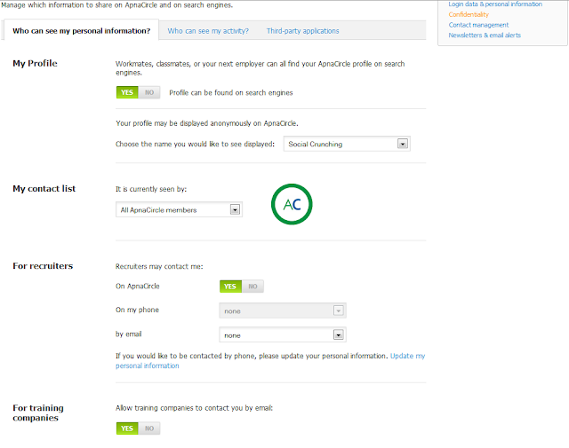
The Confidentiality page lets you configure you account' privacy details. The page has 3 tabs. The first tab, Who can see my Personal information? looks like below and yet again, we will let you explore the features but do pay special attention to the Yes/No choose buttons and the new super option where you can choose who sees your contact list. We found this one a really good one, especially on a professional portal.
ApnaCircle Confidentialy Page
And we loved the image that gets displayed as you change the My contact list drop :).

The usual news settings that you were used to seeing sits on the second tab, so we don't really go in details here but yes on the 3rd tab is a new feature whereby you are able to see all the 3rd part apps that you have provided access to, cool isn't it? Here is a look for you:
ApnaCircle Third Party Apps Setting
As you can see for yourself the applications that you may have granted permissions to access your ApnaCircle account are displayed here. If you wish you may cancel the authorization to the app from here itself, something that should please members for obvious reasons!


The new Contact Preference page allows you, as the name suggests, to manage your contacts on ApnaCircle. These settings previously did exist but were both not obvious and below the fold on the settings page. 
ApnaCircle Contact Preference
 This new look makes life easier for members and the new Yes/No buttons makes the page look good. The color combination chosen suits the eye as it blends with the rest of buttons and notification colors on the site.


The page for your Newsletters and Email Alerts settings gets a new look as well. Much cleaner than it was before.
ApnaCircle Newsletter and Email Alerts
Set the frequency for your email alerts here. Also, all your ApnaCircle Groups alerts sit here as well. If you wish you may edit the registered email id for your account here. It takes you to the Login data and Personal information page, already detailed above.


This is so much for the new look and settings available for your account on the site. The other noticeable changes comes from the MBA page and the Member Search pages. On the MBA pages the listings of the courses gets a cleaner look, plus you will now see the MBA box on the right side on your Dashboard; just below the Jobs page that existed previously as well. Which considering the way the section works is a good idea but we doubt the usage criteria since the box is well below the fold to be attracting many eyes.


The Member search results page has some subtle changes. The navigation and filters all have moved to the left of the results page, providing a lot of white space on the right. We are currently not sure of why that white space is there, unless the company has plans for some advertisement show in that area. Which again, won't be a bad idea!!


We finally leave you with a couple of points to ponder. Some translation work. The first to let us know what those French words are doing on our profile on the Member Search page will win a complementary shout out from us on our Twitter profile ;). Have fun and yes Happy Crunching!!
ApnaCircle Translation Issue


and then, look at the link that is for the Member name on the top right of the page. Why does it now points to the current page you are on? As far as we remember, it used to link the previous Member Settings page!!

Sunday, 20 May 2012

Google May Prefer Multi Makers For Jelly Bean

Nexus One on HTC, Nexus S with Samsung and so was Galaxy Nexus. But this time, as reports from WSJ suggests, Google is pretty much on way to put another Google phone in to smartphone competition but with multiple mobile device makers.
 
Google May Prefer Multi Makers For Jelly Bean
The new phone will, easily guessed, be running on Android's new version(possibly 5.0), codenamed Jelly Bean and it seems the search giant has plans to make it available for this year' Thanksgiving. According to the reports, Google is also planning to selling the new flagship phone directly to consumers and also make the new release of Android(read Jelly Bean) available to multiple mobile makers earlier than it normally does. This is a deviation from 2010 when Nexus One was launched (with HTC) and 2011/2012 when Nexus S/Galaxy Nexus were launched(with Samsung). At these times the devices were made available for consumers through wither the wireless carriers or retailers.
 
The move it seems has been thought of in an effort to gain more control over the key features and apps that run on Android devices, be it smartphone or tablets. This possibly will take all control of sales and marketing pressure exerted by the wireless carriers while providing a base for the devices to run on. The other reason(not major) would be that device makers who are not yet chosen to work with flagship phones do get upset with Google on lead-devices. The reports hint towards device-maker Motorola Mobility Holdings Inc to be involved this time for the Jelly Bean powered devices, more because of the pending nature of the acquisition the search giant made with the company. The reports are that a total of five manufacturers might come on board for the next flagship Nexus line phone and tablets. In which case (as already stated) the company will sell the devices through its website and possibly a few retailers in the U.S., Europe and Asia.
 
Whether or not the move and a new Android version with another Nexus line device will improve the competition that the company has from its biggest competitor (read Apple), is the biggest point today and for some time to come. It remains to be seen how consumers react to Google/Android selling the device directly to them and that too through the websites as we are used to testing/trying the devices a bit in stores before finally settling to buy any.

Would you like a HTC or Samsung or multiple mobile maker phone? Will you rather buy the next Nexus from Google or still prefer the retailer option? Let us know in comments!! Till we meet again, Happy Crunching!!
Post Credit

A Sr. Java developer with ApnaCircle.com Vaibhav lives in Noida, India. A very keen follower it seems about the happenings in the political world and someone who has a sharp neck of surprising you with the 2 liners on his Facebook Timeline.
Connect with him on Facebook and for his professional life on ApnaCircle.com.

Friday, 18 May 2012

Gmail Search & Circle Integration

Google just seems to be going all out with the feature roll-outs and integration in between its products. We have been trying to cover all of the news from the search giant and in process may have missed a couple for sure ;). Google is Google after all! OK, so this time what they bring-in is cute and little but a handy feature when it comes to users interacting with their network on Gmail. The new features will have new way of presenting you the contact search results and working with your Circles within the mail client.

Search for your contacts in the Gmail search box and you will be presented with the contacts details of the person searched plus, the profile photo and the mails that were sent to that contact and by that contact. And that's not all, you could even start a chat with that contact and call them right from the result presented to you with this new feature. Another obvious but good part is that if the contact you are searching for has a Google+ profile, the information that you see here in the search result will always stay updated. Here is a look for you on this search part:
Gmail Contact Search
Apart from the search menu, the same result can be viewed when you search from either the people' widget or your contacts & chat list.

Last December Google did the integration of your Circles in the left menu on Gmail. They just made it appear better. As you click on any of your Circles, you will see the profile photos of people in that Circle (on top right of page). Clicking on the pics will take you to the search results that we just detailed above.
Gmail Circle ResultsSo, who know you could do in:spam in your search box in Gmail and you will be taken to the spam folder? Well the search integration with Google+ Circles just got better. Circle search is now integrated well in to the search and filter features.

For searching messages from any of your specific Circle just type this in the search box: circle:[circle name]
For finding a mail from any of your circled contacts by doing this: has:circle
Gmail Circle Search
Enjoy this integration and have fun as you are now able to view all unread emails from your ‘Friends’ Circle or mark all the emails from a particular Circle as important. More details and the official word here on the Google' Official blog.

And yes, for enjoying these features you will need to be on the search giant' social network Google+ !!
[Image Credits: Google Official Blog]
 
Post Credit

A Software Engineer belonging to Rajasthan, India and currently put up in another lovely city of India, Pune.
Hemant works with one of the leading software companies in India, Tata Consultancy Services. And he is yet another of our readers who is a proud owner of an Android Phone!! Connect with him on Facebook for his day to day life!

Thursday, 17 May 2012

Facebook App Center Launched

In its effort to be what no one can chase, Facebook is becoming more of a platform rather than a product it was some years before when it first came in to picture. Facebook has now launched its own application center which is on the same lines as that of Apple and Google.
Facebook App Center Launched
Facebook App Center
Facebook users will be able to add apps to their Timeline with ease now. You may download apps that are available both as free and paid modes. App developers will have to pay a transaction fee (around 30%) for trying their hands on the application development for the social media giant platform. Users will be able to rate the apps they use based on their experiece and Facebook will move the high rated apps for a display on the front page of Facebook' App Center.

As Facebook is offering developers to introduce the paid apps, interested ones may register here for the beta version.You could do setting for the Timeline apps, as in to show or hide them as you may like...
Facebook App Center Launched
And the apps in options on your own Timeline will look like this:
Facebook App Center Launched
If you would like to check your activity log as regard to the apps, use this type of URL: https://www.facebook.com/YOUR_USER_NAME/allactivity. Just replace the YOUR_USER_NAME with your actual username on Facebook. If however you may want to customize the app settings and take some help on it click here for some help.

Post Credit

Works with ApnaCircle.com and lives in Faridabad, India. Deepak is a very regular and interactive reader of our posts. Loves to get involved and share ideas. Currently is on a lookout for a nice Android Phone in the market. Suggest him some if you know of some good Android smartphones in the market, preferably those that are upgradeable to Android ICS(ver. 4.0.x)
Connect with him either on ApnaCircle for his professional life or add him to your circle on Google plus.

Wednesday, 16 May 2012

Bing Search Going Social

Microsoft revamped its search engine Bing with a major redesign calling it to be around the Search Goes Social theme. The redesign came into existence last Thursday when Bing sent out the following tweet and thus making the multiple alliances with Facebook, Twitter, LinkedIn, Quora and FourSquare official:
Bing Search Going Social
Analysts suggest the move from Microsoft to be a very good and impressive one. They are hailing the new design that Bing has got, more so as the new revamped version is more social networking friendlier. That however was confirmed with the series of partnerships that Bing made with the social platforms and a move that also makes Google look stupid because of its shaky kind of relations with other social networks. We hope you remember when Google pulled off its real time Twitter integration some time back. And now with the search giant involving its own social network Google+ since its launch last year, they have made some distance if not more with other players in the market.

Bing has been able to float the search space dominated by Google and has been experimenting with social and search arenas since they launched Bing Social, a service that integrates well with Facebook and Twitter. Users of Bing will also be aware of its ability to allow them to Facebook like the webpages. So what's new with Bing Search Going Social? Bing is now able to incorporates user comments, likes and activities posted in the social networks like Facebook and Twitter. The new look is a 3 column boasting of sidebar that will focus on those in the user's social networks with their different opinions and, not surprisingly, search queries. 

And that seems not all yet as the sidebar will also let its users interact with their network via conversations on topics they like, while the friends will be able to respond either through Bing itself or through Facebook. A feature that seems pretty familiar to what what Google did with their Google+ integration in to Google News.

To add to the features, the sidebar will include a section for What Your Friends May Know. Your searches will crawl through your whole network on Facebook, Twitter, Quora, Foursquare and LinkedIn for experts on the topic. The search feature will identify any posts(related to your search query) that may have been shared by any of your friends in your network in the past. You will be both able to ask questions to your friends as well as see real-time social network activity all from Bing. And as the major surprise of the news, Bing will be including the Google results in its searches!!

Microsoft is calling the revamp “the most significant since Microsoft launched Bing three years ago.” They have announced that as of now the new version is what they call private but will soon be available for public in a beta test period.

The new design will roll out in the coming days/weeks and you can sign up here to be among the first ones to try the new revamped version. Till then you may learn the features and get to know them more in this video.


Post Credit

Business IT Student at Tavistock College aiming for a career at Google, Apple or Twitter. Hopeful Entrepreneur with strong passions for Technology.
Follow or add him to your circle on Google plus.

Tuesday, 15 May 2012

Apple's iCloud Photo Sharing Features

At a time when deals of companies buying the photo sharing app (read Facebook buys Instagram) is doing the rounds, the idea in the market is pretty much clear. Photo sharing apps are here to stay and smartphone usage in the arena is nowhere but in your hands playing with your fingers.
Apple' iCloud Photo Sharing Features
Apple Worldwide Developers Conference (WWDC) 2012 is a few weeks ago, and the news circling around is that Apple' iCloud Photo Sharing Features are only to get better with new additions to (hopefully) be announced at the Apple' event. The new updates are to include photo sharing features where by users will be allowed to comment on images. This will be more familiar to the users of Instagram or other social apps. Thus tilting the Apple' iCloud photo sharing feature more towards the social taste!

In addition(and as obvious) these photos would be open to comments by other iCloud users you share the pics with. A user's photo stream currently allows a storage of latest 1K pics clicked with their iOS device or uploaded via their computers and the pics on the iCloud will be separate and outside of this storage limit.

Current users of iOS devices will know that Apple unveiled this data storing service at last year's WWDC which provided a way for the users to sync photos and other data across their iOS devices. Concept similar to the Google Drive that we posted a few days back about. But as of now limits users to store a single set of photos online through the photo stream feature over iCloud. Enabling users to share the pics with the new social features is only going to make the iOS feature more powerful.

The move is considered to be a real thoughtful one especially after the MobileMe, Apple' cloud solution in use before iCloud, wasn't that much a success and is said to be taking its last breathes before being shut down in a few weeks form now on. With it the users will also say goodbye to the Gallery feature which let them upload and share photo galleries until now.

The whole news broke on Wall Street Journal that also hinted about Apple building a syncing service for Notes and Reminders, which is said to debut with the new iOS6.

If any of this is concrete and true we are sure to find Apple' event this June in SF a pretty amazing experience in itself and something to worth wait for. Attending the event? Share with us your expectations on the news!!

Post Credit:

A Sr. Java developer with ApnaCircle.com Vaibhav lives in Noida, India. A very keen follower it seems about the happenings in the political world and someone who has a sharp neck of surprising you with the 2 liners on his Facebook Timeline.
Connect with him on Facebook and for his professional life on ApnaCircle.com.


If you want to share some news with us or want us to write about it let us know. Click here

X